Spatial Identity:
alt-J concert experience
Visual identity + Art direction +
Projection mapping + Motion graphics
Spatial Identity studies the simulation of space through illusions. I used alt-J as a case study for the concept of an all-encompassing experience and how visual identities can transcend visual senses. The identity would permeate the tour’s branding, stage design, and marketing campaign.
Moving images were set to the band’s music and projected on to a 1:50 scale model of the stage, creating optical illusions. To extend the experiential campaign, I developed an installation piece that would travel with the band during their worldwide tour. The piece plays with shifting perspectives, allowing you to view a unique image at every angle.
Created for my master's degree dissertation.
Year
2017

alt-J gets its name from the keyboard shortcut of hitting the 'alt' and 'J' buttons to form a delta symbol. This has since established the triangle as the band's unofficial icon.

I took the triangle as a basis for creating a typographic identity for the band based on angular shapes.


I animated a stage design sequence for a mix of the band's songs and projected the moving images on a miniature model. See the full video below, filmed by Sangwoo Lee.
In approaching the band's visual identity, I wanted to focus on creating a fully immersive experience for their fans.
This involved designing the stage the band would perform on during their tour. The concept behind the stage's moving images is based on optical illusions and how illusions can simulate space through movement.

I thought about taking the experience outside the concert venue as well by creating an installation piece that is an optical illusion in itself.
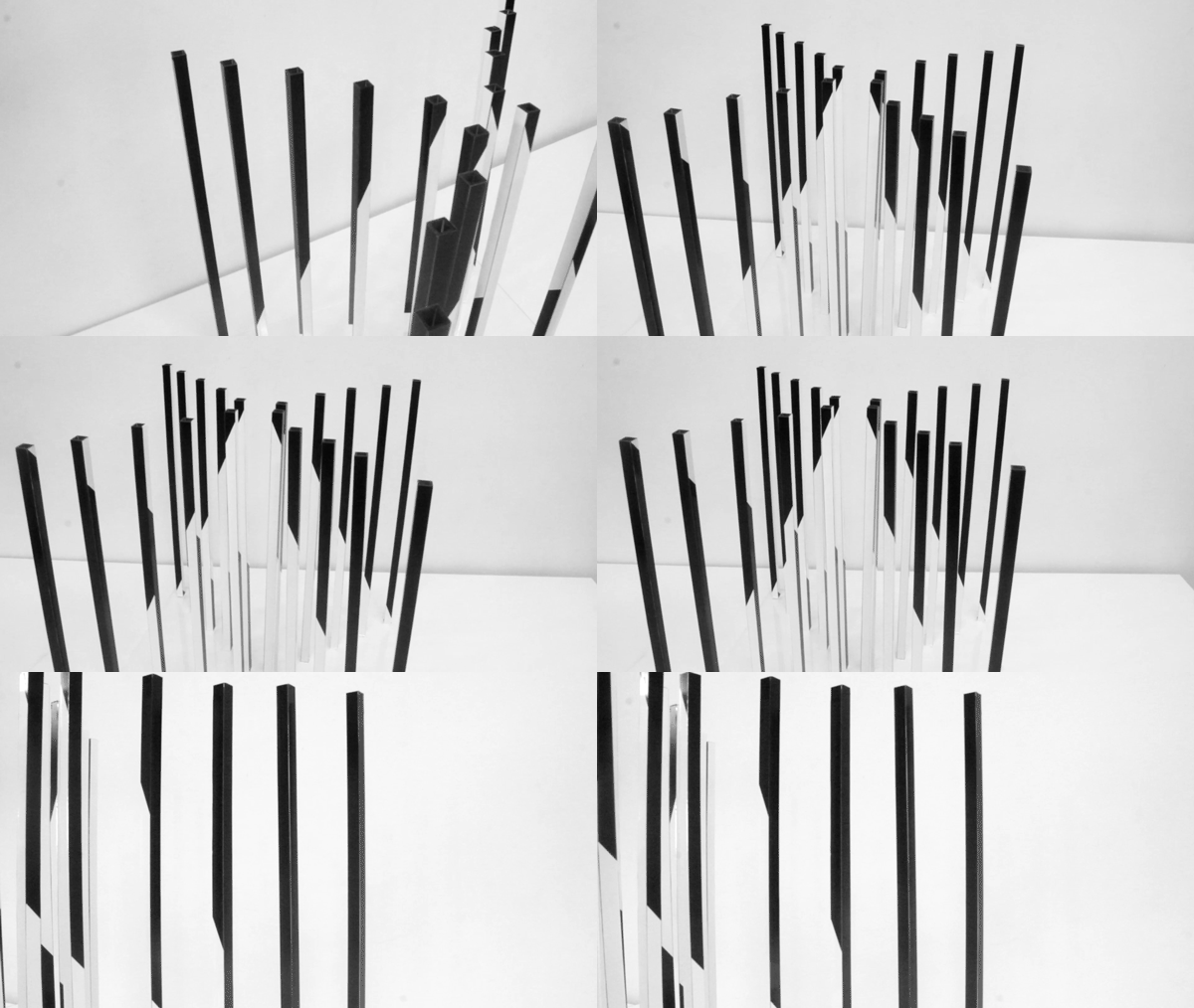
The installation is a spatial representation of the typographic logo with the visuals transforming in every angle you see it from, spelling out 'alt-J'as you walk around it.
I began with a digital simulation, then later built a scaled model of the piece in 1/5 size.


Scaled model of the installation showing its four unique sides. As you walk around the piece, you see 'alt-J' spelled out in the geometric typography designed for the band.
Watch the video below to see the piece in different perspectives.

In its full scale, the piece would be set up outside alt-J's concert venues or in popular destinations across the globe.

It would be used to promote the tour and encourage fans to share images of the piece.

All band merchandise would follow the geometric theme of the tour.


In explaining my research and process, I wrote a 7000-word document with in-depth references and work-in-progress documentation.


